Discovery days
discovery days
Branding a week of learning and innovation at Ubisoft Toronto
Internal event branding for
a future-focused studio initiative
Company
Company
Ubisoft toronto
Ubisoft toronto
Year
Year
2021
2021
role
role
graphic DESIGNER
graphic DESIGNER

OVERVIEW
OVERVIEW
Discovery Days is Ubisoft Toronto’s annual internal event where teams come together to share knowledge, explore new ideas, and imagine the future of the studio. I led the full branding process from research through execution, developing a distinct identity that gave the event its own voice while staying true to Ubisoft’s brand. Alongside this, I mentored a junior designer, guiding their contributions from exploration to final assets.
Discovery Days is Ubisoft Toronto’s annual internal event where teams come together to share knowledge, explore new ideas, and imagine the future of the studio. I led the full branding process from research through execution, developing a distinct identity that gave the event its own voice while staying true to Ubisoft’s brand. Alongside this, I mentored a junior designer, guiding their contributions from exploration to final assets.
Discovery Days is Ubisoft Toronto’s annual internal event where teams come together to share knowledge, explore new ideas, and imagine the future of the studio. I led the full branding process from research through execution, developing a distinct identity that gave the event its own voice while staying true to Ubisoft’s brand. Alongside this, I mentored a junior designer, guiding their contributions from exploration to final assets.
CHALLENGE
CHALLENGE
The event had no existing visual identity and needed to stand out within a large corporate environment. Stakeholders wanted something inspiring, innovative, and engaging that would reflect the forward-thinking spirit of Discovery Days. The identity also needed to adapt across digital and physical applications, from decks and comms to wall graphics.
The event had no existing visual identity and needed to stand out within a large corporate environment. Stakeholders wanted something inspiring, innovative, and engaging that would reflect the forward-thinking spirit of Discovery Days. The identity also needed to adapt across digital and physical applications, from decks and comms to wall graphics.
The event had no existing visual identity and needed to stand out within a large corporate environment. Stakeholders wanted something inspiring, innovative, and engaging that would reflect the forward-thinking spirit of Discovery Days. The identity also needed to adapt across digital and physical applications, from decks and comms to wall graphics.
OUTCOME
OUTCOME
The final identity gave Discovery Days a bold, cohesive presence that energized the event and helped teams rally around a shared visual language. The templates and design system made it easy for internal teams to create consistent communications, while the mentorship process gave a junior designer hands-on growth opportunities. The project demonstrated how design can shape internal culture while reinforcing brand values at scale.
The final identity gave Discovery Days a bold, cohesive presence that energized the event and helped teams rally around a shared visual language. The templates and design system made it easy for internal teams to create consistent communications, while the mentorship process gave a junior designer hands-on growth opportunities. The project demonstrated how design can shape internal culture while reinforcing brand values at scale.
The final identity gave Discovery Days a bold, cohesive presence that energized the event and helped teams rally around a shared visual language. The templates and design system made it easy for internal teams to create consistent communications, while the mentorship process gave a junior designer hands-on growth opportunities. The project demonstrated how design can shape internal culture while reinforcing brand values at scale.
SOLUTION
SOLUTION
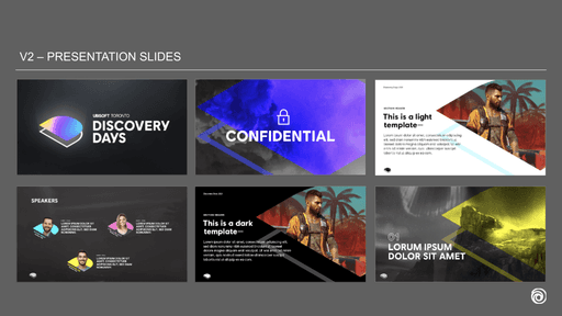
I began with research into past events and inspiration from design conferences, then explored multiple directions before aligning with stakeholders. Together with the junior designer, we developed the concept of two intersecting D’s—one filled and one outlined—symbolizing connection and collaboration. We refined the logo through multiple iterations, tested flat and 3D treatments, and built a flexible visual system of bold typography, gradients, and color. The identity extended across presentation decks, email headers, internal comms, and a large wall decal featuring the studio’s water tower and mission.
I began with research into past events and inspiration from design conferences, then explored multiple directions before aligning with stakeholders. Together with the junior designer, we developed the concept of two intersecting D’s—one filled and one outlined—symbolizing connection and collaboration. We refined the logo through multiple iterations, tested flat and 3D treatments, and built a flexible visual system of bold typography, gradients, and color. The identity extended across presentation decks, email headers, internal comms, and a large wall decal featuring the studio’s water tower and mission.
I began with research into past events and inspiration from design conferences, then explored multiple directions before aligning with stakeholders. Together with the junior designer, we developed the concept of two intersecting D’s—one filled and one outlined—symbolizing connection and collaboration. We refined the logo through multiple iterations, tested flat and 3D treatments, and built a flexible visual system of bold typography, gradients, and color. The identity extended across presentation decks, email headers, internal comms, and a large wall decal featuring the studio’s water tower and mission.


RESEARCH + EXPLORATION
RESEARCH + EXPLORATION
To ground the visual direction, I led a research and exploration phase focused on creativity and alignment with the studio’s goals.
→ Reviewed past internal initiatives and gathered input from stakeholders seeking a brand that felt inspiring, innovative, and engaging
→ Studied Ubisoft’s brand system to ensure cohesion while giving Discovery Days its own voice
→ Explored visual inspiration from editorial design and tech events to shape a bold, forward-thinking tone
In exploration, we tested the “DD” in 3D, incorporated studio/game imagery into mockups, and experimented with gradients, exaggerated type, and colourful illustrations to bring the identity to life.
RESEARCH + EXPLORATION
To ground the visual direction, I led a research and exploration phase focused on creativity and alignment with the studio’s goals.
→ Reviewed past internal initiatives and gathered input from stakeholders seeking a brand that felt inspiring, innovative, and engaging
→ Studied Ubisoft’s brand system to ensure cohesion while giving Discovery Days its own voice
→ Explored visual inspiration from editorial design and tech events to shape a bold, forward-thinking tone
In exploration, we tested the “DD” in 3D, incorporated studio/game imagery into mockups, and experimented with gradients, exaggerated type, and colourful illustrations to bring the identity to life.


iteration
iteration
With a clear direction, we moved into iteration where we translate ideas into visuals.
→ Explored flat and 3D versions of the “DD” logo, testing how depth and perspective could add impact
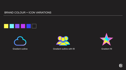
→ Collaborated with the junior designer to build colour palettes and textures inspired by Ubisoft’s game worlds
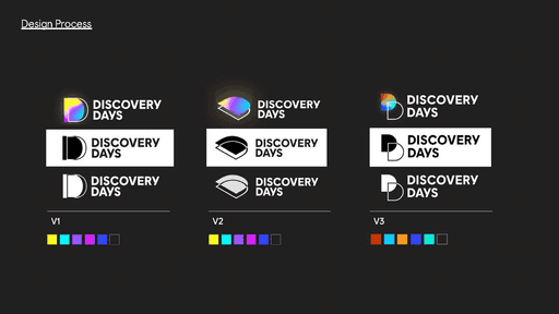
→ Developed variations of the logo based on two intersecting D’s, one filled, one outlined, to symbolize connection and collaboration.
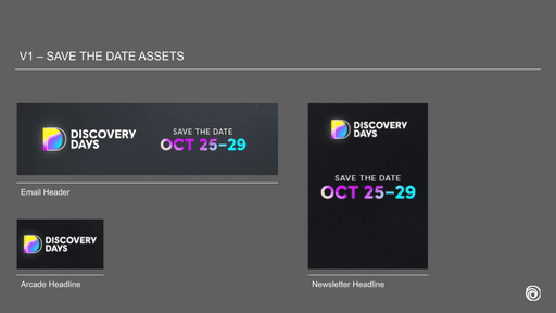
We then applied the chosen logo to key assets like email headers and presentation decks, extending the filled and outline concept into the typography for a cohesive, layered brand system.
With a clear direction, we moved into iteration where we translate ideas into visuals.
→ Explored flat and 3D versions of the “DD” logo, testing how depth and perspective could add impact
→ Collaborated with the junior designer to build colour palettes and textures inspired by Ubisoft’s game worlds
→ Developed variations of the logo based on two intersecting D’s, one filled, one outlined, to symbolize connection and collaboration.
We then applied the chosen logo to key assets like email headers and presentation decks, extending the filled and outline concept into the typography for a cohesive, layered brand system.
iteration
With a clear direction, we moved into iteration where we translate ideas into visuals.
→ Explored flat and 3D versions of the “DD” logo, testing how depth and perspective could add impact
→ Collaborated with the junior designer to build colour palettes and textures inspired by Ubisoft’s game worlds
→ Developed variations of the logo based on two intersecting D’s, one filled, one outlined, to symbolize connection and collaboration.
We then applied the chosen logo to key assets like email headers and presentation decks, extending the filled and outline concept into the typography for a cohesive, layered brand system.


result
result
After reviewing the logo variations with the team, Version 1 stood out as the strongest featuring an illusion of light shining through the intersecting D’s. The use of gradient created a sense of depth and discovery, aligning perfectly with the event’s theme of uncovering new ideas and perspectives.
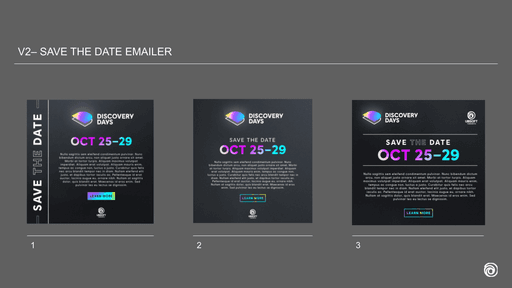
We extended the visual system further by applying exaggerated typography to express key studio values, turning statements into bold, expressive moments within the identity.
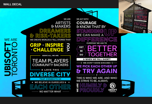
For the physical space, we designed a large scale wall decal featuring the silhouette of our iconic water tower. Inside, we embedded the studio’s mission statement, creating a visual centerpiece that was both grounding and aspirational.
Together, these final assets helped bring the brand to life across digital and physical environments, creating a cohesive, immersive experience for the Discovery Days event.
After reviewing the logo variations with the team, Version 1 stood out as the strongest featuring an illusion of light shining through the intersecting D’s. The use of gradient created a sense of depth and discovery, aligning perfectly with the event’s theme of uncovering new ideas and perspectives.
We extended the visual system further by applying exaggerated typography to express key studio values, turning statements into bold, expressive moments within the identity.
For the physical space, we designed a large scale wall decal featuring the silhouette of our iconic water tower. Inside, we embedded the studio’s mission statement, creating a visual centerpiece that was both grounding and aspirational.
Together, these final assets helped bring the brand to life across digital and physical environments, creating a cohesive, immersive experience for the Discovery Days event.
result
After reviewing the logo variations with the team, Version 1 stood out as the strongest featuring an illusion of light shining through the intersecting D’s. The use of gradient created a sense of depth and discovery, aligning perfectly with the event’s theme of uncovering new ideas and perspectives.
We extended the visual system further by applying exaggerated typography to express key studio values, turning statements into bold, expressive moments within the identity.
For the physical space, we designed a large scale wall decal featuring the silhouette of our iconic water tower. Inside, we embedded the studio’s mission statement, creating a visual centerpiece that was both grounding and aspirational.
Together, these final assets helped bring the brand to life across digital and physical environments, creating a cohesive, immersive experience for the Discovery Days event.
the coffee street
Web | Visual Identity
2022
2022
the coffee street
Web | Visual Identity
2022
2022
the coffee street
Web | Visual Identity
2022
2022
the coffee street
VIEW
VIEW
Designto festival
Art direction | Illustration
2020
2020
Designto festival
Art direction | Illustration
2020
2020
Designto festival
VIEW
VIEW
Designto festival
VIEW
VIEW
©2025
Go Back To Top
©2025
Go Back To Top
©2025
Go Back To Top
©2025
Go Back To Top
©2025
Go Back To Top
©2025
Go Back To Top
©2025
Go Back To Top